Why Mobile Website Design Matters When You Build Your Own Website
Why mobile website design matters when you build your own website. Saying that mobility has become the new trend across the globe won’t be wrong. The mobile market is growing with every passing day. A recent example to this is the analytics linked with mobile marketing revealed recently. Google does even punish sites that are not mobile friendly and responsive by moving them lower down in those search results. Check if your website is mobile friendly.
If we look at the people using mobile, you must not be surprised to know that somewhere in mid of 2015 a report was shared, in which they revealed that the global mobile data traffic globally has increased drastically. Taking a hike to 2.5 exabytes a month in 2014, the data traffic showed around 70% of growth in comparison to 1.5 exabytes per month in 2013, and that’s why mobile website design matters.
More And More People Use Their Smart Phone To Search The Web
If your website is not mobile friendly you could be loosing out. Those customers that visit using their smart phones will simply move to another mobile friendly website, as your site will be to large for their small screen. If you require any help to create your mobile website design please feel free to contact us. According to a website, around 80% of internet users own a smartphone and they prefer using it to accomplish their day to day tasks.
The primary reason behind is the ease, and standardized form of living they provide through applications. Looking at the interest of people, public and private sector companies have not only started mobile application development for their product/service.
We now know the primary reason behind public and private enterprises shifting to mobile. However, despite this big inclination, not many companies manage to make big through their mobile applications.
Why Design Matters Most
A mobile application’s design is the foremost impression you create in front of your users. Having a great looking mobile website design that’s fast loading will keep your visitors on the site. Or you could even have a mobile app, let us suppose that your brand value entitled them to download your app, but upon downloading your app the design looks terrible.
You and me have both done it. If you are on your mobile and visit a website or mobile app that has a bad design we hit the back button on the website or delete the app. So its important to create a mobile friendly website when building a website. And make sure your mobile app is deigned to look good on smart phones.
According to a report, a mobile application in android store loses 77% of its users within the first three days of installing.
Let’s find out how a better design can help you lower this number:
1- Enhanced User Experience
A good mobile website design directly serves better user experience. Any glitches with the design section can directly ruin the UX, and subsequently, your app users will begin to uninstall your ‘brilliant app idea’ without even waiting to see the features it has.
By availing them better experience through an impeccable combination of all the elements of UI / UX designing, you’d be able to successfully keep them engaged in your mobile application.
2- What They See Is What They Buy
Let’s accept this biggest market rule. A good design enhances the look of your mobile application and hence serves the purpose in a very diligent manner. You just need to ensure that the design you have chosen for your mobile application narrates your product/service and suits your target audience impeccably.
3- Ease Of Access
A better design directly accelerates the app access for users. They can easily navigate and go through the controls. This effortless operation keeps them stuck with the application. So at the time of designing an application, it isn’t just the colors that matter, but also the flow.
Ensure that the app features are placed in order, and you are not making the user hold ‘right ear with left hand’. Keep it easy and engaging, you don’t have to shower all your creativity at single place.
4- Visibility
When we talk about the website, things are quite big and bold, but in the case of applications you need to fit the tiny mobile screens. This includes tabs and the color combination both. The tabs should be large enough to be visible and operational.
Also, the color combination should be in a way that they don’t overlap each other. You need to know what is to be highlighted and what not.
5- Content Always Matters
Content is King and so is its placement. You need to keep the content as per its importance. Apart from this the font size and color should also be taken into consideration. These all when combined together, add graciously to the overall appearance and eventually user experience of your mobile website design.
Conclusion
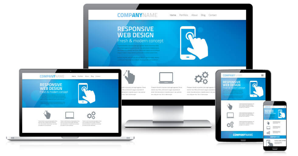
If you are building a website you must have a responsive design. This means that your website will look great on any device its viewed on. The size of the screen will adjust depending on the device its being viewed on. If you are using a mobile app it must work properly. The design must adjust itself and look good on smart phones.
You may also like this:
Article Entry: Why Mobile Website Design Matters When You Build Your Own Website
PUBLISHED: JAN 27, 2017 / UPDATED 08, AUGUST 2023 – ARTICLE: WHY MOBILE WEBSITE DESIGN MATTERS WHEN YOU BUILD YOUR OWN WEBSITE
 Author: Michael John
Responsive Web Design
| 